Pages

Monday, 7 December 2015

Visual Design - Speed Painting


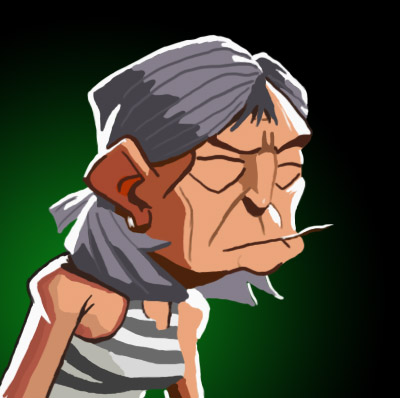
In class we were given around an hour to complete a speed painting image. This is the result of my speed painting. I think it turned out decent, especially for the time that I had.

Tuesday, 1 December 2015

Gameplay and Interactivity - The Winter Submission

This blog post will explain the highlights of my Gameplay and Interactivity submission, including my thoughts on how it went. I thoroughly enjoyed this assignment and plan on improving this piece in the future. In this assignment we had to create a level segment of a game which had roughly 2 minutes worth of gameplay. The level had to be a grey box design and it had to be coded and animated.

Pre-Production:

This is the one sheet of my game. It explains the game as an overall and is how I started the project.
This is the storyboard for my game, it shows 4 main milestones in the game that I plan on adding for the 2 minute's of gameplay. I hope that I can add all these event's to the game up to opening the locked door.
The above an below images are a plan view which I used when creating the
pirate ship in Maya. I didn't have enough time to add the second floor which
is the image below. These act as maps for the level.


Coding:

I've checked through all of my code, using techniques that I've been taught in class. Coding was difficult, the concept was hard to grasp but I really tried and it worked out pretty well for the 2 minutes of gameplay I needed.

This is the script for the story of my game. It's only a few lines of dialogue
but I feel that no more is needed for a game of 2 minutes. I kept the
dialogue separated by short time intervals, there's enough time to read it
but it's not too long that the characters speech seems unrealistically
long.

The code above is to make sure that the mouse is centered during the game. 

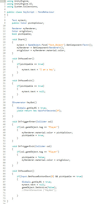
This piece of code does multiple things:
  • When near the key will change it's colour to red.
  • When your mouse is over the key red text appears saying "I am a key".
  • When clicked you will pick up the key.
  • When you pick up the key you will be able to walk through a door.
This was probably the most difficult piece of coding I completed in my 
opinion. I felt it helped me to develop my skills.

This is the first door rotation code, this code rotates the door around 
a pivot in the direction specified. It detects when the player is near
and rotates it so that the door opens away from the player. I had
problems with this code originally because It would not rotate in the right
direction. I fixed this by changing the transform direction. 
This is the another door rotation script, it's very similar to
 the previous except the rotation direction needed to be opposite
this is because the doors world position.

The code above affects a telescope at the front of the ship, it floats up and down with this script. I would make this a pick-up if the game was longer than 2 minutes.
This is the global script, it means than when the game starts you
can't open the door that needs the key. When you pickup the key
in the key script it changes this value to true, therefore
allowing you to walk through the door.

The Visual Side:


This is a view of the unity editor and my game. Showing the Hierarchy and Project tabs.


This is a full view of the grey box pirate ship that I created in Maya
which I exported into unity (which is being viewed now). I tried to get
the sails to move and be realistically animated with the nCloth tool in Maya.
I set up turbine systems with air to realistically recreate the effect of wind on
a sail. However this could not be transferred over to unity which just left
them flat. I managed to create a large proportion of the ships body but
did not have time to add furniture, however for a grey box level you can still
experience how the level will look roughly. 
This is a view while in the game. The pirate ship moves and sways on the moving sea. I create the illusion of the ship moving forward by animating the rocks I created in the distance. These rocks move past the ship slowly. In the level there is fog, this fog doesn't allow you to see the end of the ocean or all of the rocks. This means that my rocks can be played on a loop without it being noticeable. The random arrangement makes it difficult to recognise them as being the same group of rocks.


This is another view in the game showing what the ship looks like on the deck.
It also shows other features I added like the lights. 


In conclusion I am happy with how my 2 minute game turned out. I encountered quite a few problems along the way with coding and aesthetic features such as the sails. I feel that I overcame these limitations to a reasonable standard, fixing code and making the 2 minute game work. I felt my game concept is very different to most peoples. The main difference was that my level is vehicle, it moves and sways. This created limitations in how large my level could be, it also made problems which then had to be resolved but I don't regret choosing this idea. I had to make sure everything on the ship was grouped together, if I hadn't then some objects wouldn't of have rotated and moved with the rest of the ship. I also had a problem where the player would fall through the ship.

But every problem I encountered helped me to develop, it taught me how to solve these problems and get the best solutions. This unit helped me grow as a game developer, learning new skills while giving me experience. This was beneficial in my growth and I also enjoyed the experience. 

Friday, 27 November 2015

Visual Design - Anthropomorphic Character (Frog)

Sketches:

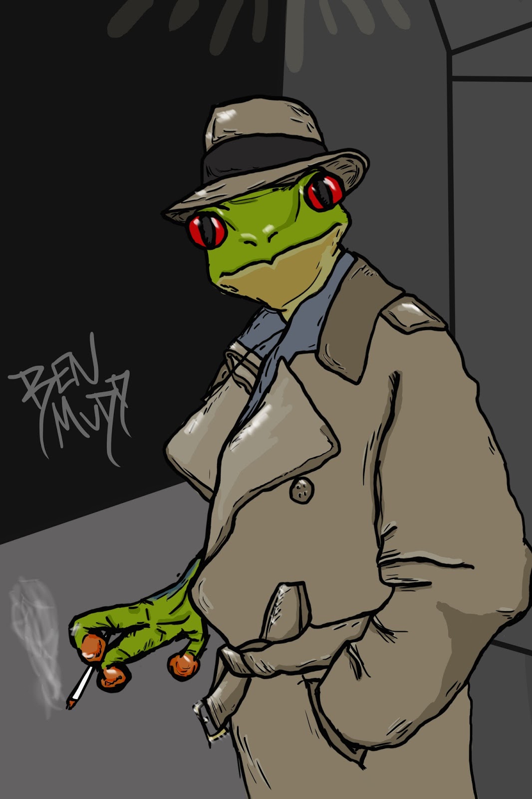
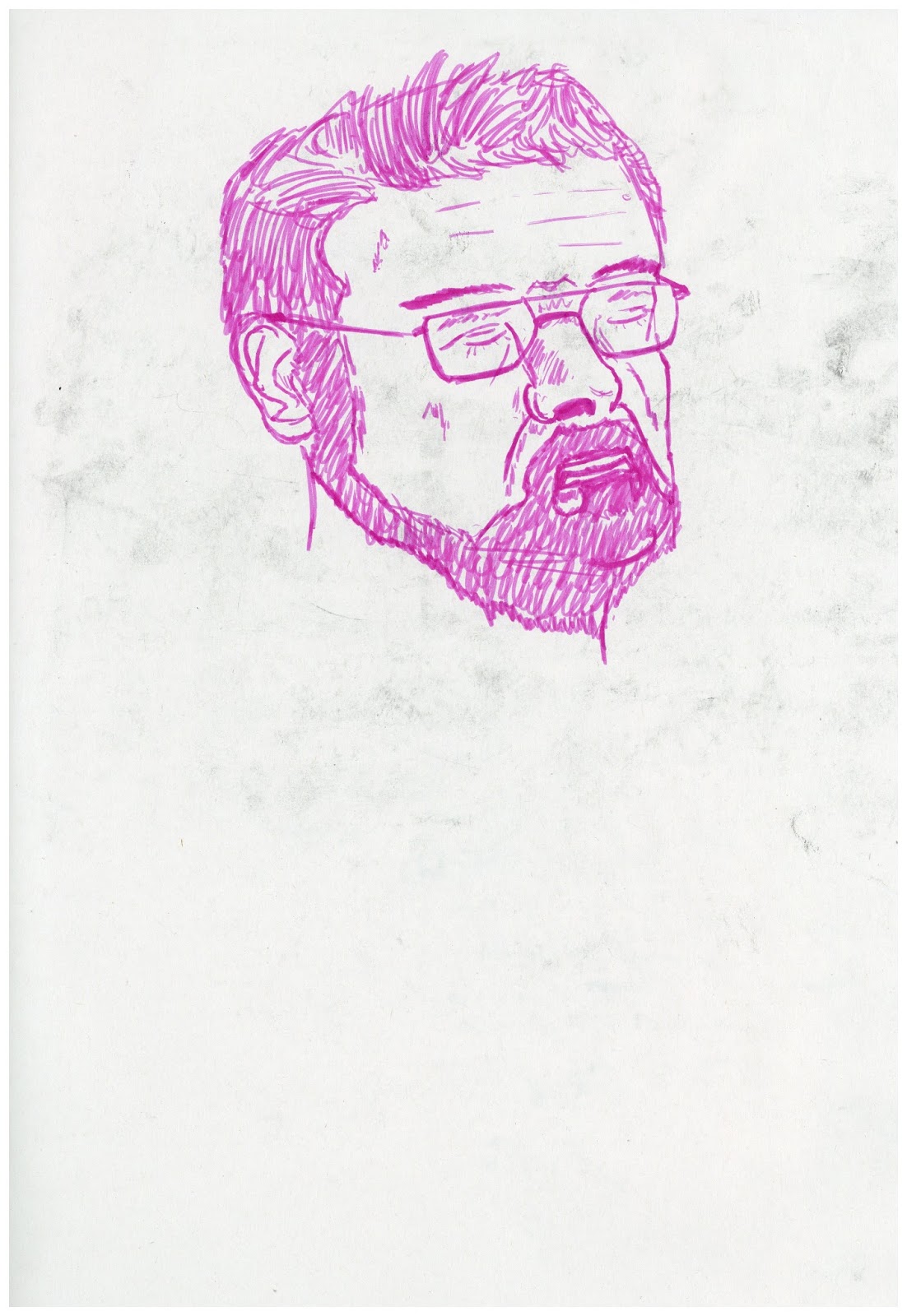
For this task we had to create and anthropomorphic character (a frog in a humanoid form). Above are some sketches I designed of frogs in roles that what usually be filled by humans. I love the character they have in their new roles and how it makes you see things in a new perspective. 

Final:

Above is my final design for this piece. I decided to use the detective idea shown above. I really tried to experiment with new tools for this assignment. On this assignment I used the dodge tool to create highlights on the character to create a more realistic appearance with better lighting. As for colours and form I took inspiration from the poison dart frog, I thought the shaping of the face and hands were rather intriguing and wanted to try adept them to the pose you see above. I had a lot of trouble with the positioning and rotation of the hand holding the cigarette, creating a pose that looks like it could be realistically holding it. I believe I resolved the issue in the end, I did this my positioning the fingers closer to one another. I feel this piece turned out well and feel it's one of my best pieces of concept art to date. I really feel like that I'm improving each week now. 

Friday, 20 November 2015

Visual Design - Perspective And Lighting Tank

Mood Board:

In this assignment we had to design a futuristic tank using techniques of perspective and lighting which we had previously learnt. Above is my research showing images of tanks, some futuristic designs and some current day tanks for a weird variety.

Final Piece:

For my tank design I decided to take a simplistic approach. I still kept with the assignment criteria, my tank has two point perspective and has appropriate lighting. I decided to go with a simplistic design because I feel that if a tank was designed in the recent future that they wouldn't stray too far from the current conventions. On my tank I added thrusters/hovering devices on the side instead of tracks and I used a different turret design. 

I'm happy with how the piece turned out, I also decided to colour it in after (on the image below). However I prefer the black and white version. This definitely helped me develop my skills of shadow placement and lighting.


Final Piece (After Playing With Colours):


Saturday, 14 November 2015

Visual Design - Futuristic Room


For this assignment we explored the use of two point perspective. The task was to use two point perspective to creature a futuristic room. The above image is my final result. In this piece I wanted to explore using different methods to create the textures of the walls and such. I used an overlay layer on parts of the wall and floor to create a more realistic appearance. This piece was interesting and honestly quite difficult. I struggled particularly with the laser, converting and drawing in two point perspective was challenging for this particularly because of the angles of elevation on it. I feel it turned out okay and doesn't look too out of place though. Overall I am happy with this piece.

Wednesday, 4 November 2015

Visual Design - Tentacle


Mood Board:

For this assignment we had to research creatures with tentacles and then create a tentacle creature of our own. Above is the images I collected for inspiration.

Sketches:

Above are my sketches for tentacle creature ideas that I had. In the end I chose the tenta-ghoul idea, mainly for the expression he had, looking like he had just jumped out to scare you.

Final:

Above is my final design for the assignment. This design is largely based on a ghost but with features such as tentacles to create a more menacing look. I decided to add some additional effects to make him look more ghostly. I edited the transparency as the bottom to have a fading effect, I also adding a blue plasma like substance to make him look more ghostly. I felt blue colours in my palette were best because blue is a very cold colour and a colour which resonates well with the colour of a stereotypical ghost (usually whites and greys). 
I enjoyed this piece and I'm truly satisfied with the result, I think this is once of my best pieces so far.